 Wagtail Documentation
How to use images in templates
The image tag inserts an XHTML-compatible img element into the page, setting its src, width, height, and alt. See also More control over the img tag.
The syntax for the tag is thus:
{% image [image] [resize-rule] %}
Both the image and resize rule must be passed to the template tag.
For example:
{% load wagtailimages_tags %}
...

<!-- Display the image scaled to a width of 400 pixels: -->
{% image page.photo width-400 %}

<!-- Display it again, but this time as a square thumbnail: -->
{% image page.photo fill-80x80 %}
In the above syntax example [image] is the Django object referring to the image. If your page model defined a field called “photo” then [image] would probably be page.photo. The [resize-rule] defines how the image is to be resized when inserted into the page. Various resizing methods are supported, to cater to different use cases (for example lead images that span the whole width of the page, or thumbnails to be cropped to a fixed size).
Note that a space separates [image] and [resize-rule], but the resize rule must not contain spaces. The width is always specified before the height. Resized images will maintain their original aspect ratio unless the fill rule is used, which may result in some pixels being cropped.
Multiple formats
To render an image in multiple formats, you can use the picture tag:
{% picture page.photo format-{avif,webp,jpeg} width-400 %}
Compared to image, this will render a <picture> element with a fallback <img> within and one <source> element per extra format. The browser picks the first format it supports, or defaults to the fallback <img> element. For example, the above will render HTML similar to:
<picture>
    <source srcset="/media/images/pied-wagtail.width-400.avif" type="image/avif">
    <source srcset="/media/images/pied-wagtail.width-400.webp" type="image/webp">
    <img src="/media/images/pied-wagtail.width-400.jpg" alt="A pied Wagtail" width="400" height="300">
</picture>
In this case, if the browser supports the AVIF format it will load the AVIF file. Otherwise, if the browser supports the WebP format, it will try to load the WebP file. If none of those formats are supported, the browser will load the JPEG image. The order of the provided formats isn’t configurable – Wagtail will always output source elements in the following order: AVIF, WebP, JPEG, PNG, and GIF. This ensures the most optimized format is provided whenever possible.
The picture tag can also be used with multiple image resize rules to generate responsive images.
Responsive images
Wagtail provides picture and srcset_image template tags which can generate image elements with srcset attributes. This allows browsers to select the most appropriate image file to load based on responsive image rules.
The syntax for srcset_image is the same as image, with two exceptions:
{% srcset_image [image] [resize-rule-with-brace-expansion] sizes="[my source sizes]" %}
The resize rule should be provided with multiple sizes in a brace-expansion pattern, like
width-{200,400}. This will generate thesrcsetattribute, with as many URLs as there are sizes defined in the resize rule, and one width descriptor per URL. The first provided size will always be used as thesrcattribute, and define the image’s width and height attributes, as a fallback.The
sizesattribute is essential. This tells the browser how large the image will be displayed on the page, so that it can select the most appropriate image to load.
Here is an example of srcset_image in action, generating a srcset attribute:
{% srcset_image page.photo width-{400,800} sizes="(max-width: 600px) 400px, 80vw" %}
This outputs:
<img srcset="/media/images/pied-wagtail.width-400.jpg 400w, /media/images/pied-wagtail.width-800.jpg 800w" src="/media/images/pied-wagtail.width-400.jpg" alt="A pied Wagtail" sizes="(max-width: 600px) 400px, 80vw" width="400" height="300">
Here is an example with the picture tag:
{% picture page.photo format-{avif,webp,jpeg} width-{400,800} sizes="80vw" %}
This outputs:
<picture>
    <source sizes="80vw" srcset="/media/images/pied-wagtail.width-400.avif 400w, /media/images/pied-wagtail.width-800.avif 800w" type="image/avif">
    <source sizes="80vw" srcset="/media/images/pied-wagtail.width-400.webp 400w, /media/images/pied-wagtail.width-800.webp 800w" type="image/webp">
    <img sizes="80vw" srcset="/media/images/pied-wagtail.width-400.jpg 400w, /media/images/pied-wagtail.width-800.jpg 800w" src="/media/images/pied-wagtail.width-400.jpg" alt="A pied Wagtail" width="400" height="300">
</picture>
Available resizing methods
The available resizing methods are as follows:
max
(takes two dimensions)
{% image page.photo max-1000x500 %}
Fit within the given dimensions.
The longest edge will be reduced to the matching dimension specified. For example, a portrait image of width 1000 and height 2000, treated with the max-1000x500 rule (a landscape layout) would result in the image being shrunk so the height was 500 pixels and the width was 250.
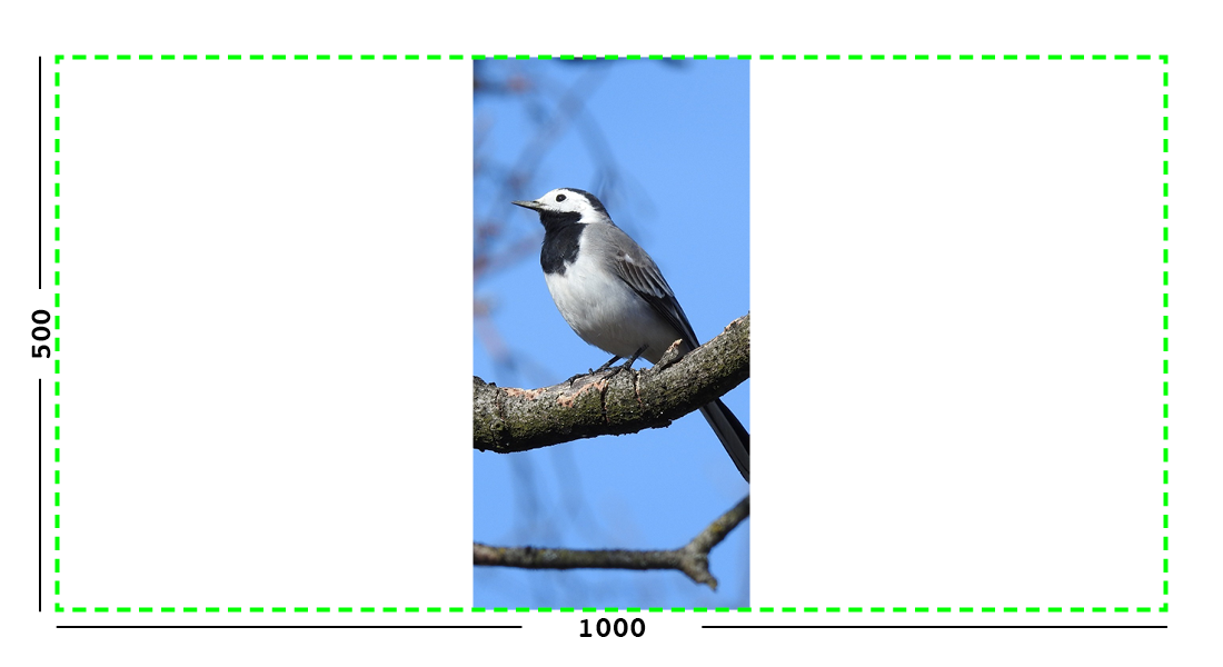
Example: The image will keep its proportions but fit within the max (green line) dimensions provided.
min
(takes two dimensions)
{% image page.photo min-500x200 %}
Cover the given dimensions.
This may result in an image slightly larger than the dimensions you specify. A square image of width 2000 and height 2000, treated with the min-500x200 rule would have its height and width changed to 500, that is matching the width of the resize-rule, but greater than the height.
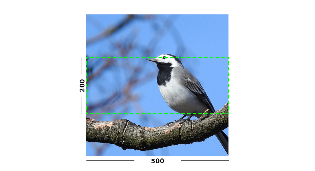
Example: The image will keep its proportions while filling at least the min (green line) dimensions provided.
width
(takes one dimension)
{% image page.photo width-640 %}
Reduces the width of the image to the dimension specified.
height
(takes one dimension)
{% image page.photo height-480 %}
Reduces the height of the image to the dimension specified.
scale
(takes a percentage)
{% image page.photo scale-50 %}
Resize the image to the percentage specified.
fill
(takes two dimensions and an optional -c parameter)
{% image page.photo fill-200x200 %}
Resize and crop to fill the exact dimensions specified.
This can be particularly useful for websites requiring square thumbnails of arbitrary images. For example, a landscape image of width 2000 and height 1000 treated with the fill-200x200 rule would have its height reduced to 200, then its width (ordinarily 400) cropped to 200.
This resize-rule will crop to the image’s focal point if it has been set. If not, it will crop to the center of the image.
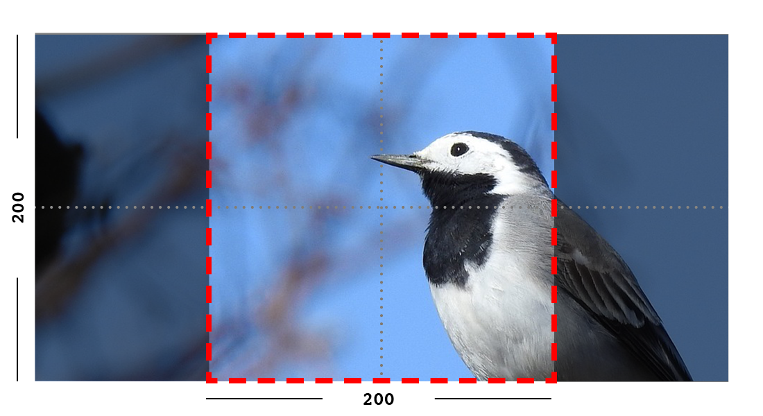
Example: The image is scaled and also cropped (red line) to fit as much of the image as possible within the provided dimensions.
On images that won’t upscale
It’s possible to request an image with fill dimensions that the image can’t support without upscaling. For example an image of width 400 and height 200 requested with fill-400x400. In this situation the ratio of the requested fill will be matched, but the dimension will not. So that example 400x200 image (a 2:1 ratio) could become 200x200 (a 1:1 ratio, matching the resize-rule).
Cropping closer to the focal point
By default, Wagtail will only crop enough to change the aspect ratio of the image to match the ratio in the resize-rule.
In some cases (for example thumbnails), it may be preferable to crop closer to the focal point, so that the subject of the image is more prominent.
You can do this by appending -c<percentage> at the end of the resize-rule. For example, if you would like the image to be cropped as closely as possible to its focal point, add -c100:
{% image page.photo fill-200x200-c100 %}
This will crop the image as much as it can, without cropping into the focal point.
If you find that -c100 is too close, you can try -c75 or -c50. Any whole number from 0 to 100 is accepted.
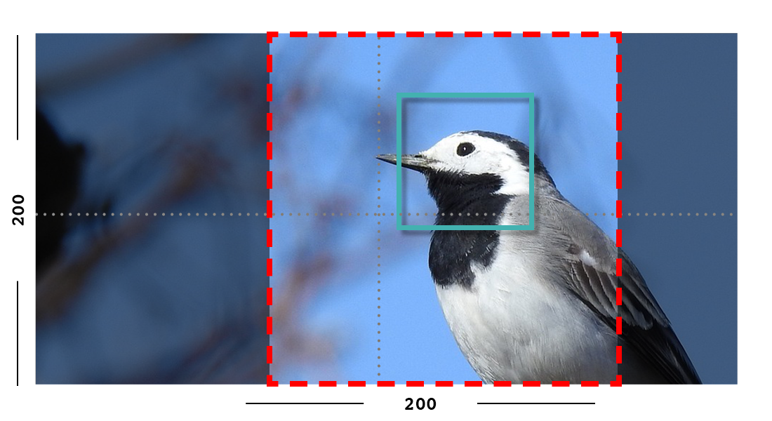
Example: The focal point is set off center so the image is scaled and also cropped like fill, however the center point of the crop is positioned closer to the focal point.
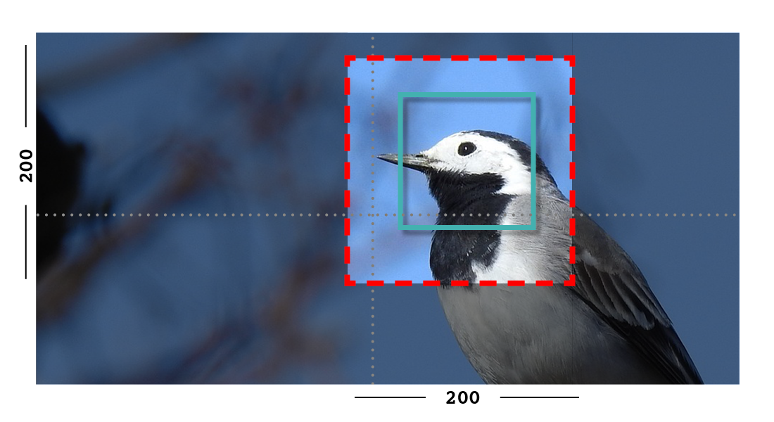
Example: With the -c75 set, the final crop will be closer to the focal point.
original
(takes no dimensions)
{% image page.photo original %}
Renders the image at its original size.
Note
Wagtail does not allow deforming or stretching images. Image dimension ratios will always be kept. Wagtail also does not support upscaling. Small images forced to appear at larger sizes will “max out” at their native dimensions.
More control over the img tag
Wagtail provides two shortcuts to give greater control over the img element:
1. Adding attributes to the {% image %} tag
Extra attributes can be specified with the syntax attribute="value":
{% image page.photo width-400 class="foo" id="bar" %}
You can set a more relevant alt attribute this way, overriding the one automatically generated from the title of the image. The src, width, and height attributes can also be overridden, if necessary.
You can also add default attributes to all images (a default class or data attribute for example) - see Adding default attributes to all images.
2. Generating the image “as foo” to access individual properties
Wagtail can assign the image data to another variable using Django’s as syntax, to access the underlying image Rendition (tmp_photo):
{% image page.photo width-400 as tmp_photo %}

<img src="{{ tmp_photo.url }}" width="{{ tmp_photo.width }}"
    height="{{ tmp_photo.height }}" alt="{{ tmp_photo.alt }}" class="my-custom-class" />
This is also possible with the srcset_image tag, to retrieve multiple size renditions:
{% srcset_image page.photo width-{200,400} as tmp_photo %}

<img
    src="{{ tmp_photo.renditions.0.url }}"
    width="{{ tmp_photo.renditions.0.width }}"
    height="{{ tmp_photo.renditions.0.height }}"
    alt="{{ tmp_photo.renditions.0.alt }}"
    srcset="{{ tmp_photo.renditions.0.url }} 200w, {{ tmp_photo.renditions.1.url }} 400w"
    sizes="100vw"
    class="my-custom-class"
/>
And with the picture tag, to retrieve multiple formats:
{% picture page.photo format-{avif,jpeg} as tmp_photo %}

{{ tmp_photo.formats.avif.0.url }}
{{ tmp_photo.formats.jpeg.0.url }}
Note
The image property used for the src attribute is image.url, not image.src.
Renditions contain the information specific to the way you’ve requested to format the image using the resize-rule, dimensions, and source URL. The following properties are available:
url
URL to the resized version of the image. This may be a local URL (such as /static/images/example.jpg) or a full URL (such as https://assets.example.com/images/example.jpg), depending on how static files are configured.
width
Image width after resizing.
height
Image height after resizing.
alt
Alternative text for the image, typically taken from the image title.
attrs
A shorthand for outputting the attributes src, width, height, and alt in one go:
<img {{ tmp_photo.attrs }} class="my-custom-class" />
full_url
Same as url, but always returns a full absolute URL. This requires WAGTAILADMIN_BASE_URL to be set in the project settings.
This is useful for images that will be re-used outside of the current site, such as social share images:
<meta name="twitter:image" content="{{ tmp_photo.full_url }}">
If your site defines a custom image model using AbstractImage, any additional fields you add to an image (such as a copyright holder) is not included in the rendition.
Therefore, if you’d added the field author to your AbstractImage in the above example, you’d access it using {{ page.photo.author }} rather than {{ tmp_photo.author }}.
(Due to the links in the database between renditions and their parent image, you could access it as {{ tmp_photo.image.author }}, but that has reduced readability.)
Adding default attributes to all images
We can configure the wagtail.images application to specify additional attributes to add to images. This is done by setting up a custom AppConfig class within your project folder (i.e. the package containing the top-level settings and urls modules).
To do this, create or update your existing apps.py file with the following:
from wagtail.images.apps import WagtailImagesAppConfig


class CustomImagesAppConfig(WagtailImagesAppConfig):
    default_attrs = {"decoding": "async", "loading": "lazy"}
Then, replace wagtail.images in settings.INSTALLED_APPS with the path to CustomUsersAppConfig:
INSTALLED_APPS = [
    ...,
    "myapplication.apps.CustomImagesAppConfig",
    # "wagtail.images",
    ...,
]
Now, images created with {% image %} will additionally have decoding="async" loading="lazy" attributes. This also goes for images added to Rich Text and ImageBlock blocks.
Images embedded in rich text
The information above relates to images defined via image-specific fields in your model. However, images can also be embedded arbitrarily in Rich Text fields by the page editor (see Rich Text (HTML).
Images embedded in Rich Text fields can’t be controlled by the template developer as easily. There are no image objects to work with, so the {% image %} template tag can’t be used. Instead, editors can choose from one of several image “Formats” at the point of inserting images into their text.
Wagtail comes with three pre-defined image formats, but more can be defined in Python by the developer. These formats are:
Full width
Creates an image rendition using width-800, giving the tag the CSS class
full-width.
Left-aligned
Creates an image rendition using width-500, giving the tag the CSS class
left.
Right-aligned
Creates an image rendition using width-500, giving the tag the CSS class
right.
Note
The CSS classes added to images do not come with any accompanying stylesheets or inline styles. For example, the left class will do nothing, by default. The developer is expected to add these classes to their front-end CSS files, to define exactly what they want left, right or full-width to mean.
For more information about image formats, including creating your own, see Image Formats in the Rich Text Editor.
Output image format
Wagtail may automatically change the format of some images when they are resized:
PNG and JPEG images don’t change the format
GIF images without animation are converted to PNGs
AVIF images are converted to PNGs
BMP images are converted to PNGs
WebP images are converted to PNGs
It is also possible to override the output format on a per-tag basis by using the
format filter after the resize rule.
For example, to make the tag always convert the image to a JPEG, use format-jpeg:
{% image page.photo width-400 format-jpeg %}
You may also use format-png or format-gif.
Lossless AVIF and WebP
You can encode the image into lossless AVIF or WebP format by using format-avif-lossless or format-webp-lossless filter respectively:
{% image page.photo width-400 format-avif-lossless %}
{% image page.photo width-400 format-webp-lossless %}
Background color
The PNG and GIF image formats both support transparency, but if you want to convert images to JPEG format, the transparency will need to be replaced with a solid background color.
By default, Wagtail will set the background to white. But if a white background doesn’t fit your design, you can specify a color using the bgcolor filter.
This filter takes a single argument, which is a CSS 3 or 6-digit hex code representing the color you would like to use:
{# Sets the image background to black #}
{% image page.photo width-400 bgcolor-000 format-jpeg %}
Image quality
Wagtail’s JPEG image quality settings default to 85 (which is quite high). AVIF and WebP default to 80. This can be changed either globally or on a per-tag basis.
Changing globally
Use the WAGTAILIMAGES_AVIF_QUALITY, WAGTAILIMAGES_JPEG_QUALITY and WAGTAILIMAGES_WEBP_QUALITY settings to change
the global defaults of AVIF, JPEG, and WebP quality:
# settings.py

# Make low-quality but small images
WAGTAILIMAGES_AVIF_QUALITY = 50
WAGTAILIMAGES_JPEG_QUALITY = 40
WAGTAILIMAGES_WEBP_QUALITY = 45
Note that this won’t affect any previously generated images so you may want to delete all renditions so they can regenerate with the new setting. This can be done from the Django shell:
# Replace this with your custom rendition model if you use one
>>> from wagtail.images.models import Rendition
>>> Rendition.objects.all().delete()
You can also directly use the image management command from the console for regenerating the renditions:
./manage.py wagtail_update_image_renditions --purge
You can read more about this command from wagtail_update_image_renditions
Changing per-tag
It’s also possible to have different AVIF, JPEG, and WebP qualities on individual tags by using avifquality, jpegquality, and webpquality filters. This will always override the default setting:
{% image page.photo_avif width-400 avifquality-40 %}
{% image page.photo_jpeg width-400 jpegquality-40 %}
{% image page.photo_webp width-400 webpquality-50 %}
Note that this will not affect PNG or GIF files. If you want all images to be low quality, you can use this filter with format-avif, format-jpeg, or format-webp (which forces all images to output in AVIF, JPEG, or WebP format):
{% image page.photo width-400 format-avif avifquality-40 %}
{% image page.photo width-400 format-jpeg jpegquality-40 %}
{% image page.photo width-400 format-webp webpquality-50 %}
Generating image renditions in Python
All of the image transformations mentioned above can also be used directly in Python code. See Generating renditions in Python.
SVG images
Wagtail supports the use of Scalable Vector Graphics alongside raster images. To allow Wagtail users to upload and use SVG images, add “svg” to the list of allowed image extensions by configuring WAGTAILIMAGES_EXTENSIONS:
WAGTAILIMAGES_EXTENSIONS = ["gif", "jpg", "jpeg", "png", "webp", "svg"]
SVG images can be included in templates via the image template tag, as with raster images. However, operations that require SVG images to be rasterized are not currently supported. This includes direct format conversion, e.g. format-webp, and bgcolor directives. Crop and resize operations do not require rasterization, so may be used freely (see Available resizing methods).
The image tag’s preserve-svg positional argument may be used to restrict the operations applied to an SVG image to only those that do not require rasterization. This may be useful in situations where a single image tag declaration is applied to multiple source images, for example:
{% for picture in pictures %}
    {% image picture fill-400x400 format-webp preserve-svg %}
{% endfor %}
In this example, any of the image objects that are SVGs will only have the fill-400x400 operation applied to them, while raster images will have both the fill-400x400 and format-webp operations applied. If the preserve-svg argument is not used in this example, an error will be raised when attempting to convert SVG images to webp, as this is not possible without a rasterization library.
Security considerations
Wagtail’s underlying image library, Willow, is configured to mitigate known XML parser exploits (e.g. billion laughs, quadratic blowup) by rejecting suspicious files.
When including SVG images in templates via the image tag, they will be rendered as HTML img elements. In this case, script elements in SVGs will not be executed, mitigating XSS attacks.
If a user navigates directly to the URL of the SVG file embedded scripts may be executed, depending on server/storage configuration. This can be mitigated by setting appropriate Content-Security-Policy or Content-Disposition headers for SVG responses:
setting
Content-Security-Policy: default-src 'none'will prevent scripts from being loaded or executed (as well as other resources - a more relaxed policy ofscript-src 'none'may also be suitable); andsetting
Content-Disposition: attachmentwill cause the file to be downloaded rather than being immediately rendered in the browser, meaning scripts will not be executed (note: this will not prevent scripts from running if a user downloads and subsequently opens the SVG file in their browser).
The steps required to set headers for specific responses will vary, depending on how your Wagtail application is deployed.